Building a design system without pausing the roadmap.
project type
Design System
Timeline
12 Month rollout
team
Product Owner
Business Analyst
Head of Engineering
7 Developers
2 QA E
My role
UI/UX Designer

When I joined HR Duo there was no library, no brand guidance and no shared foundation of any kind. Every developer had built their own buttons. I started the system inside a dashboard redesign, then spent the next year propagating it through features I didn't own.
context
Every developer had built their own version of everything.
HR Duo had grown feature by feature, and each feature had been built by whoever owned it. That meant buttons designed independently in a dozen places, several typefaces in use with no rule about which went where, tables that shared no behaviour, and type sizes chosen per screen. There was no brand guidance to fall back on either — not a thin design system, but no reference point at all.
None of that was carelessness. It's what happens when a product ships continuously and nobody owns the layer underneath the features. Each decision was locally reasonable; the cost only appeared when you looked across them.
Users relearned the same interaction in each module. The hierarchy broke down on dense HR data screens — exactly where clarity mattered most.
Designers rebuilt the same components. Handoff was manual and lossy. With no source of truth, "correct" was whatever shipped last.
Every feature carried a custom design bill. UI updates meant hunting instances by hand, and new designers took weeks to get productive.


Audit
The audit wasn't a phase. It was what became obvious while building features.
I didn't get a discovery period, and I wouldn't have asked for one. Working across features surfaced the inconsistencies faster than a dedicated review would have, because I was hitting them as problems rather than cataloguing them as observations.
What mattered was writing them down in a form specific enough to argue about. Nobody funds foundational work on the basis of taste, and "the UI feels inconsistent" is an opinion. The list below is a set of defects.
Buttons & CTAs
The same action styled differently between modules, with hover and disabled treatments that varied by screen rather than by meaning
Forms & inputs
Validation timing and error placement differed between modules, so the same mistake was reported in a different position depending on where you made it
Data tables
Sorting, filtering and row-action behaviour implemented independently — the densest, most-used surface in the product had no shared contract
Spacing
No underlying scale. Values were chosen per screen, so the rhythm broke as soon as two modules sat next to each other.
Typography
Sizes and weights accumulated feature by feature, leaving no reliable hierarchy on dense HR data screens
Modals & overlays
Conflicting dismiss behaviour between patterns — users couldn't predict whether clicking outside would save, cancel or do nothing
Principles
Three rules that settled most arguments before they started.
Predictability beats novelty.
Enterprise users aren't here to be delighted. They're here to finish a task they've done four hundred times. Familiarity is the feature.
Reuse before invention.
If a pattern exists, use it. New patterns need a reason that survives being said out loud in front of the team.
The system serves the roadmap, not the reverse.
If the library ever slowed a team down, that was a bug in the system — not a discipline problem in the team.
Build
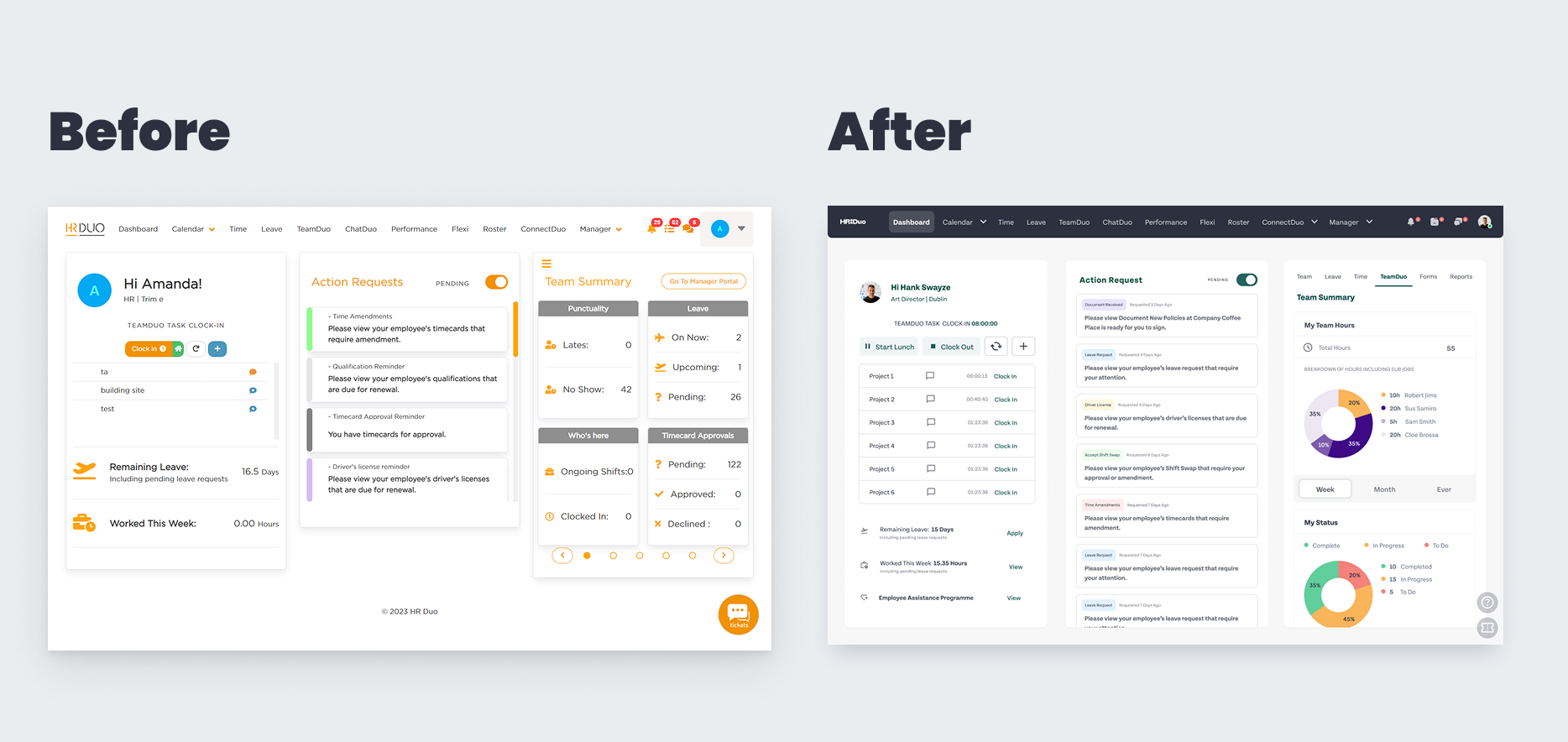
It started as a dashboard redesign, not a systems project.
Nobody was going to approve twelve months of foundational work with no visible output. So the system didn't begin as a proposal — it began as the main dashboard, which was already on the roadmap and already needed rebuilding.
That screen is where the primitives got decided: the colour palette, the typeface and the scale, the spacing, the first real buttons. Choosing them for a specific screen rather than in the abstract meant every decision had to survive contact with actual content on day one. And because the dashboard was the screen everyone saw first, the argument for the rest of the system had a working reference instead of a deck.
01
Research & Discovery
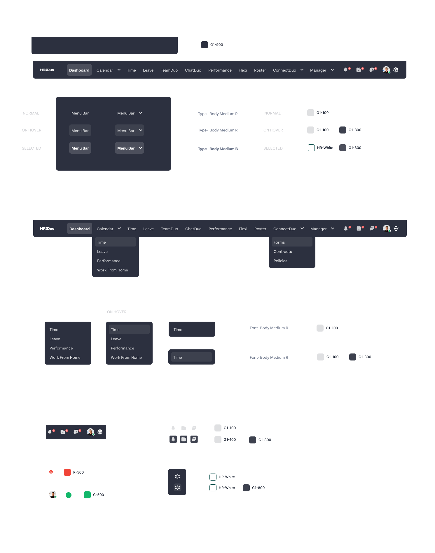
Colour was organised by role at the family level and by value within it: HRD for brand, R for error, O for warning, G for success, Gr for neutral greys, plus supporting colours drawn from the brand palette. Depth varied by need — the brand ramp ran to ten steps because brand appeared in the most contexts, while others stopped at six, or three. I didn't generate steps nobody was going to use.
Alongside that, a type hierarchy and a spacing and grid scale, all settled on the dashboard first and then generalised. There had been no brand reference of any kind, so this was as much establishing a visual language as systematising one — the palette, the typeface and the scale didn't exist to be tidied up. They had to be decided.
02
Components
Form elements and validation, data tables and filters, navigation, feedback and status UI. Every component shipped with its full state set — default, hover, focus, disabled, loading, error, empty — and was stress-tested against real HR Duo data rather than placeholder content. Held to WCAG 2.1 AA for contrast and keyboard traversal.
03
Product patterns
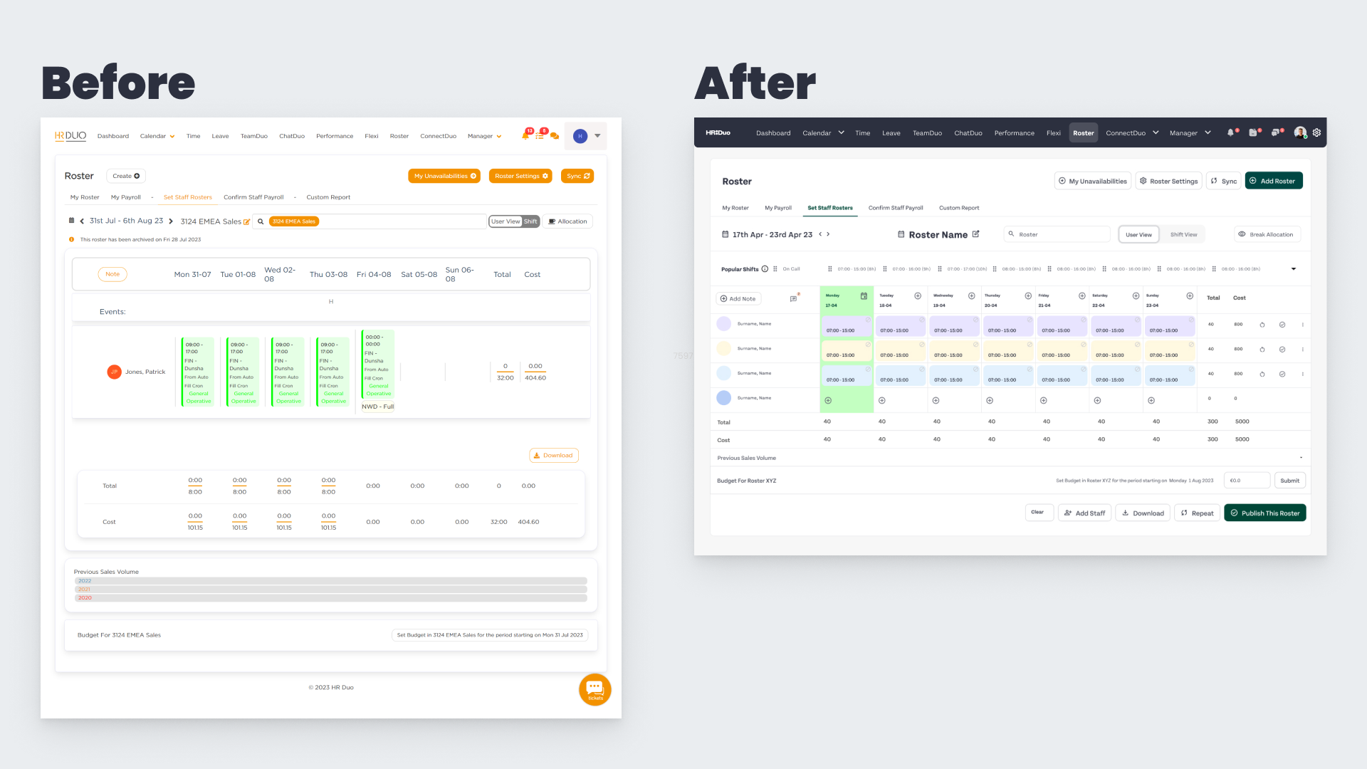
Components solved the small decisions; patterns solved the repeated ones. CRUD workflows, dashboard layouts, empty states, onboarding flows. This is where the system started returning real time — a new admin screen became an assembly job instead of a design project.
04
Documentation & handoff
Usage guidelines, component behaviour, edge cases, and a defined handoff process inside Figma — written for engineers as much as designers, because most consumers of the system weren't designers.


Adoption
Components crossed feature boundaries. Ownership didn't.
Each developer owned their own feature. But the same button, table and form field appeared across several of those features at once — so no component could be changed inside one person's work without landing in someone else's.
That's the reason rollout took over a year, and it's the thing I'd underestimated. I'd assumed the hard part would be agreeing what good looked like. Agreement was quick. Propagation was slow, because every change had to find a moment in someone else's schedule to arrive.
Adoption wasn't a persuasion problem. It was a coordination problem across people who each owned a slice.
The resistance I did meet wasn't disagreement about consistency — nobody was defending three kinds of button. It was delivery cost. Refactoring a screen that already worked is real engineering time spent on something no customer will notice, at the expense of something they asked for.
That reframed how I picked battles. Where an inconsistency was actively costing something — a table behaving unlike every other table, validation appearing in a different place depending on the module — the case survived a prioritisation conversation. Where it was only aesthetic, it waited, and some of it was still waiting when I left.
What made it stick in the end wasn't visual consistency. It was that designers stopped rebuilding the same patterns from scratch, and conversations with engineering got shorter — a shared component with defined states removes a whole category of decision that used to be made per screen, every time.
HR software carries dense, permission-dependent, regulation-shaped data. The system had to bend without snapping — a component that works on a five-row table and fails on eight hundred isn't a component, it's a mockup.
The limit
One seam I couldn't close.
The Figma library was the source of truth for design. It was never the source of truth for the product. Engineers re-implemented every token and component in code, which meant each one existed twice and the two agreed by convention rather than by construction.
That worked while someone was watching. Drift was only ever caught in review, and review is a person, not a system — the moment attention moved elsewhere, the two copies started separating again. Documentation reduced it. Nothing short of shared code would have removed it.
That gap is the reason I'm now learning to build systems on the other side of the seam: tokens that compile into CSS variables rather than being transcribed, components that live in Storybook where design and engineering read the same artefact. I owned the design half of this system well. Owning both halves is the next thing.

Impact
What changed.
Consistent UI across every module
Contrast failures resolved to WCAG 2.1 AA
Dense data screens legible at scale
New UI assembled rather than designed from scratch
Handoff moved from interpretation to specification
New designers productive in days, not weeks
Shared vocabulary between design and engineering
Foundation reused for subsequent modules
Design decisions made once, applied everywhere
Retrospective
What I'd do differently.
I designed components speculatively. Some were built because they looked like things a system ought to have, not because anything in the product was asking for them. They sat unused. I now promote a pattern into the system only after seeing repeated demand for it — the second or third time a problem appears, not the first time I anticipate it.
I set ownership rules too late. The question that needed answering early was a simple one: at what point does a local pattern become a system pattern, and who decides? Without that, similar solutions evolve independently in different corners of the product, and by the time you notice you're not adding a component — you're reconciling three.
I'd fix that now with lightweight contribution criteria and a design–engineering review at the point of promotion, introduced while the library is small enough for the rules to still be cheap.
My tokens carried role, but not usage. The families were organised by intent — R was error, O was warning — so a colour told you which family it belonged to. What it didn't tell you was what to do with it. R-500 doesn't say whether it's a background, a border or text, so the decision about which step to reach for still lived in the designer's head instead of in the system.
I learned the layer above it afterwards, at Sim Local: naming by usage rather than by family, so surface-danger and text-danger carry their intent through handoff and a contrast fix happens in one place instead of everywhere the colour appears. HR Duo was my first design system, built while I was also introducing myself to the team. Given the same brief now, that's the layer I'd add.
Documentation came last and should have run alongside. Every undocumented component generated the same question repeatedly, and answering it in person doesn't scale past about four people.
A design system isn't a library. It's an agreement about how decisions get made — the library is just where that agreement is stored.
I learned that faster by building it inside live product work than I would have by building it beside the product and hoping it got picked up. The parts that lasted were the ones that made someone's job easier that week — not the ones that made the library look complete.