Roster and scheduling, rebuilt around its constraints.
project type
Web platform & mobile app
Timeline
12 Month rollout
team
Product Owner
Business Analyst
Head of Engineering
2 Developers
2 QA
My role
UI/UX Designer
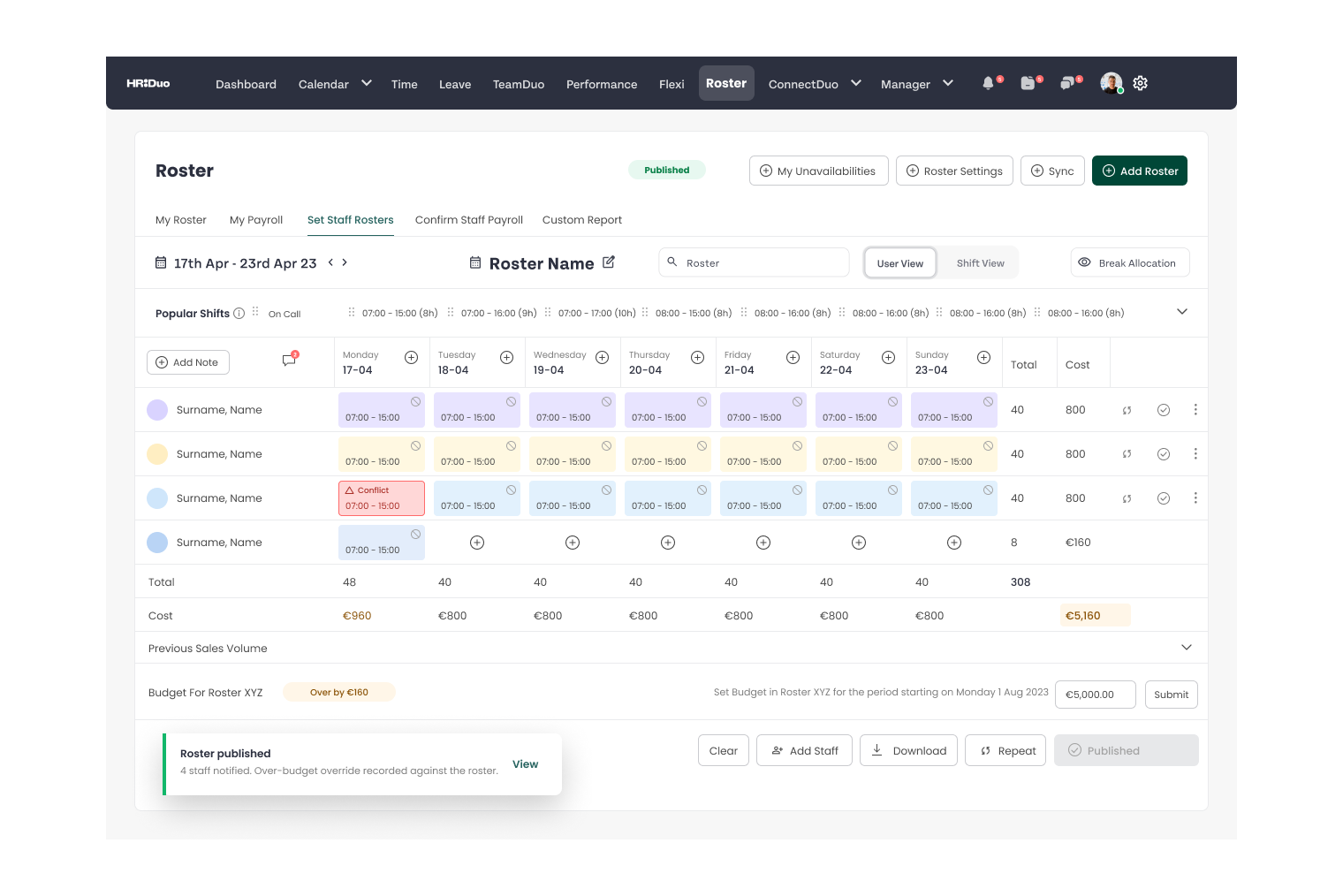
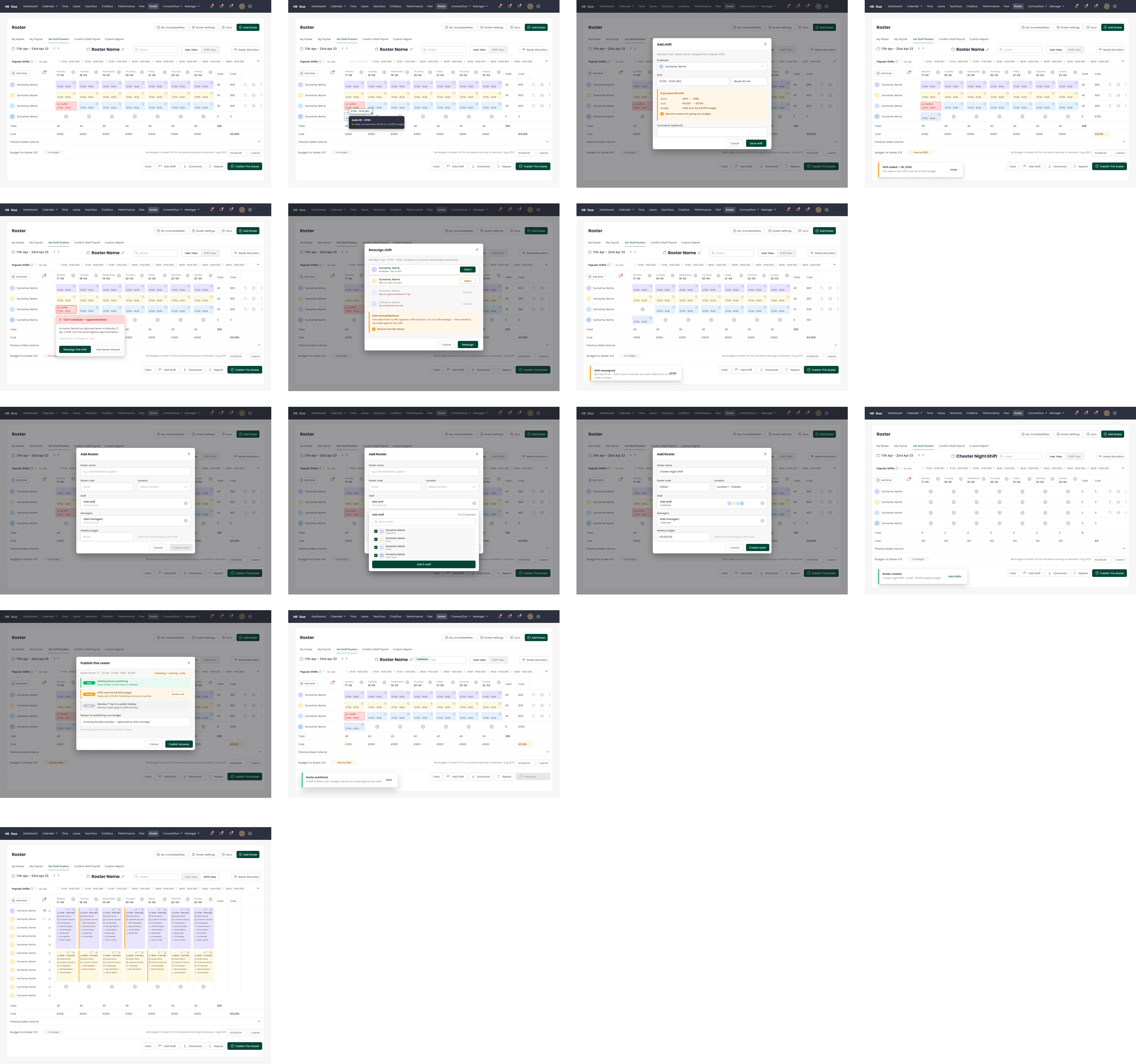
Managers were finding out about conflicts after publishing a roster, not while building one. The redesign moved every rule the system knew about to the moment the decision was being made.
context
A scheduling tool that had outgrown its own interface.
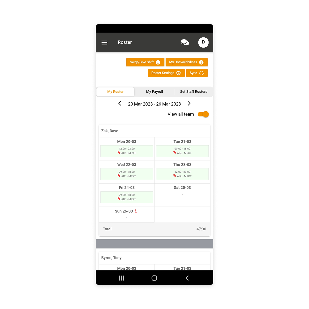
HR Duo served organisations with shift-based teams — hospitality, healthcare, logistics, field services. Roster building worked well enough when it meant one team in one location. Under multi-site deployments it stopped scaling: several contract types with different entitlements, coverage floors that varied by role and site, and leave requests competing for the same dates.
What got the work prioritised wasn't a design complaint. The roster had a practical ceiling at around 100 employees on web — past that, the interface stopped being difficult and started being unusable. That made it a commercial problem rather than an aesthetic one: the product couldn't take on larger customers until the workflow could carry them.
Underneath that sat the daily cost. Managers were discovering critical errors after rosters had been published. Each one meant rework, an awkward message to someone whose shift had just changed, and a small withdrawal from how much the team trusted the tool. Enough of those and scheduling migrates to WhatsApp — which is where we found a good deal of it already living.
Conflicts surfaced after publishing, not during scheduling
Availability, leave and contracted hours lived on separate screens
No visibility into coverage until a shift was already short
Mobile carried web-level complexity for a much narrower set of tasks
Leave balance wasn't visible at the point of request
No fast path for reporting sick leave
Policy rules existed but weren't enforced at the moment of decision
Contract types behaved inconsistently across features
Changes and approvals left no reliable record
Post-publish rework consumed manager time every week
Decisions routed around the product into email and messaging apps
Onboarding new organisations was slow — the model had to be explained

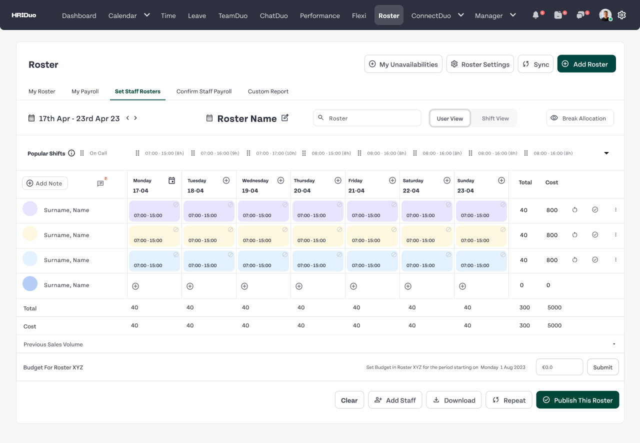
Approach
From a canvas that accepts input to a surface that presents constraints.
The finding that changed the shape of the project: managers weren't using the tool incorrectly. The tool was asking them to do work it should have been doing itself. Checking who was available, cross-referencing approved leave, tracking contracted hours against what had already been assigned — all of it manual, none of it visible in the interface where the decision was being made.
So the shift was conceptual before it was visual. A roster isn't a blank canvas that accepts whatever a manager types into it. It's a surface that should show what's possible before someone commits to what they want.
The interface should show you what's possible before you commit to what you want.

Each stage governs the one after it. An approved leave request changes coverage. An availability edit invalidates a draft roster. A sick call at 7am creates a gap that has to be resolved before the shift starts. Redesigning any single stage on its own produces a clean screen sitting inside a workflow that still breaks.
Key decision
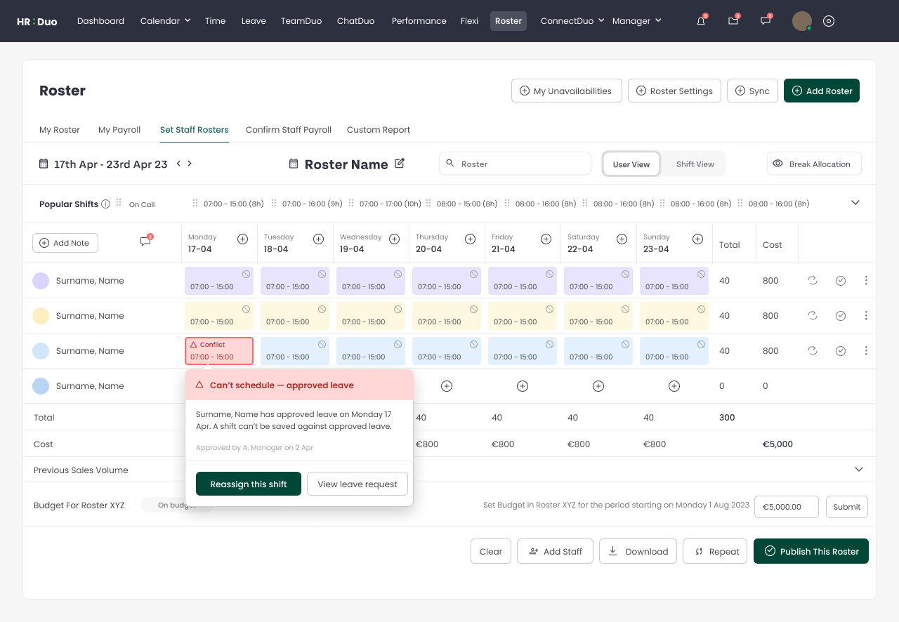
A rules ladder, not a wall of blocks.
The system had to enforce contract limits, coverage floors and leave policy. The obvious implementation is to block anything that violates a rule. I argued against that.
Hard stop
Blocks the action
Scheduling someone during approved leave. Exceeding a contracted hours cap with no override path available.
Warning
Allows, records override
Coverage dropping to the minimum threshold. A part-time employee approaching their contracted hour limit.
Informational
Surfaces, doesn't interrupt
A shift overlapping a public holiday. A zero-hours employee who hasn't been scheduled recently.
A manager giving a part-time employee an extra shift because someone called in sick isn't violating policy. They're making a reasonable decision using context the system doesn't have. Blocking it doesn't make the product safer — it makes it unusable, and it pushes the decision into email where there's no record at all.
The ladder also exists to protect the warnings. If everything blocks, people stop reading, and the genuinely safety-critical stops lose their meaning along with the rest. Proportionality is what keeps them legible.
The position I held throughout: block only where someone genuinely cannot proceed safely. Everything below that threshold gets a warning that preserves the manager's control — because turning an exception into a dead end doesn't remove the exception, it removes their ability to handle it inside the product.


Platform
Consistency was the wrong goal.
I started from the opposite conclusion to the one I ended with. My early concepts pushed to bring more roster-management capability onto mobile — managers handling changes from the floor rather than at a desk.
Screen density is what ended that. At the scale we were designing for, a manager building a roster across multiple locations needs to hold a lot in view at once and compare across it. On a phone you can show enough to decide or enough to read, not both. Reproducing the desktop planning experience on mobile would have produced something worse than either.
So desktop stayed the primary planning environment, and mobile stopped trying to compete with it. That reads as a clean strategic decision now; at the time it was me conceding that the thing I'd been exploring wasn't going to work.
Planning and decision-making
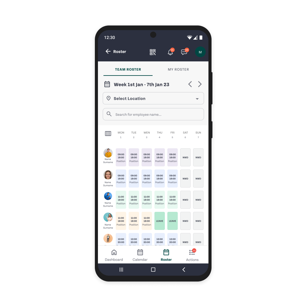
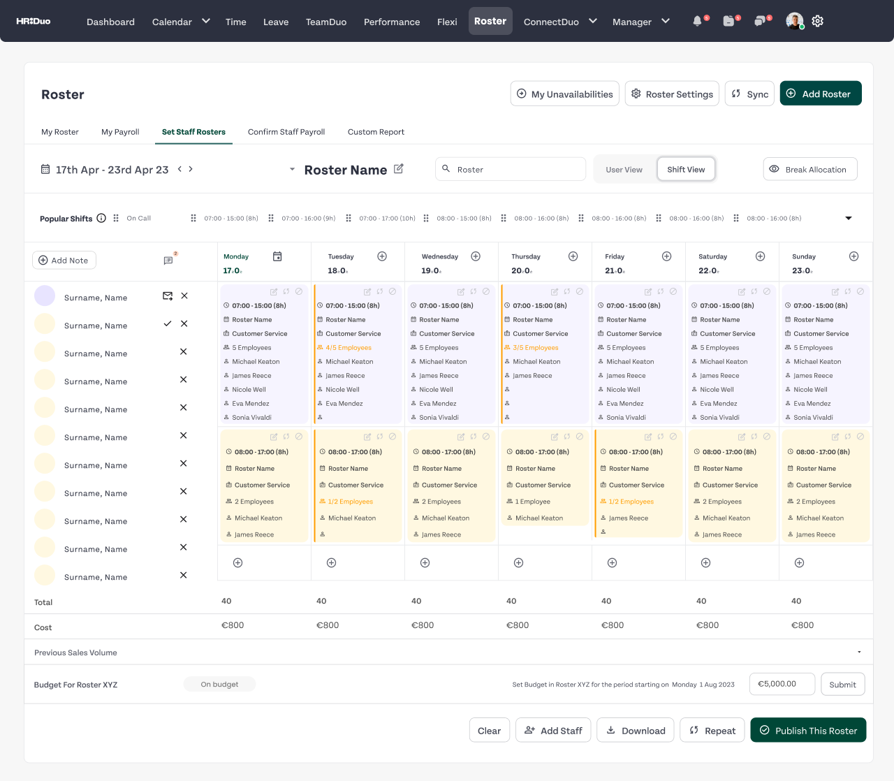
Calendar-first roster building with the full team visible
Conflict detection and resolution before publishing
Leave and availability overlaid directly on the schedule
Contract-aware scheduling with threshold management
Coverage analysis across teams and locations
Daily action and clarity
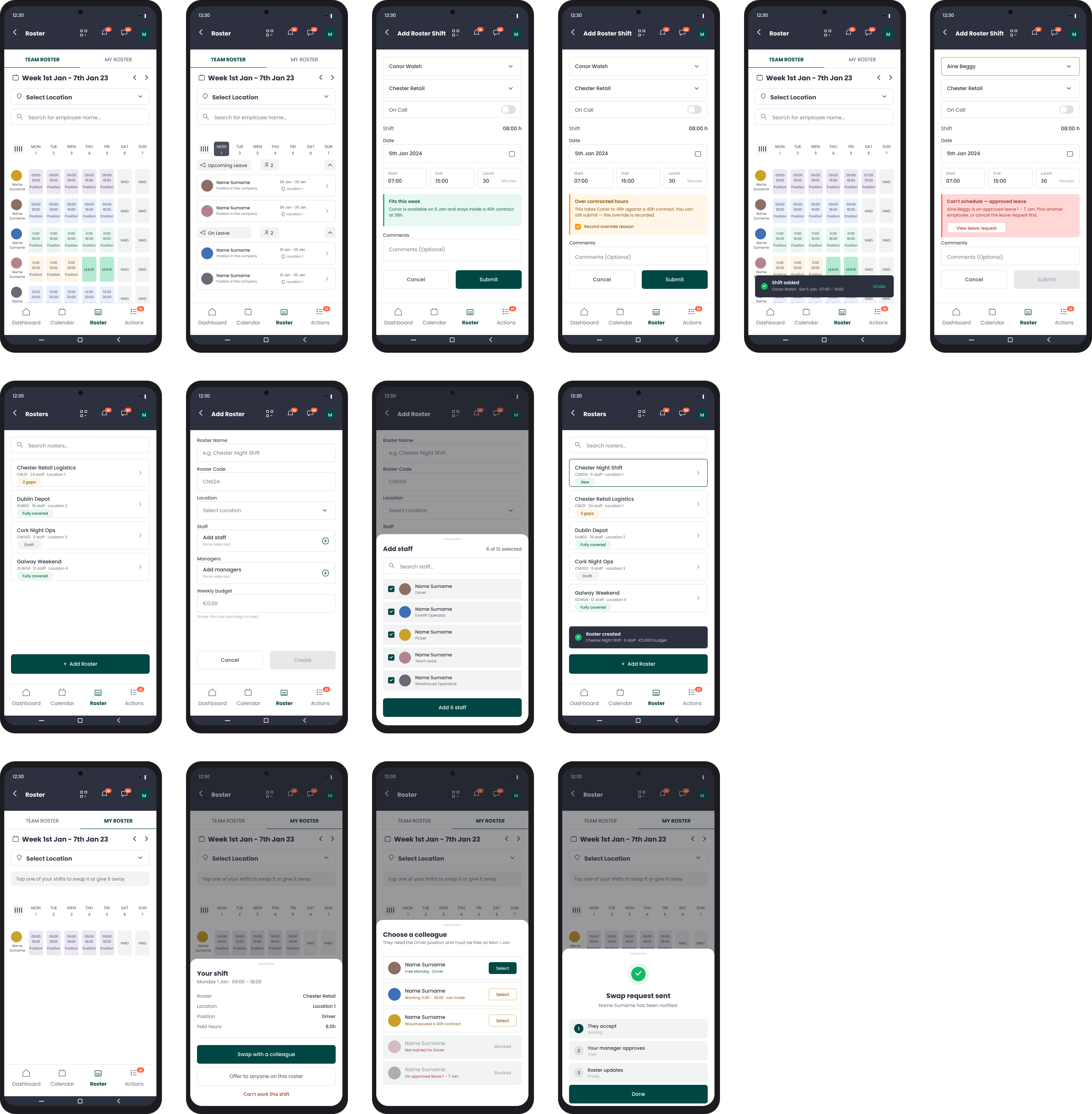
Next shift on the home screen, with nothing above it
Weekly schedule readable at a glance
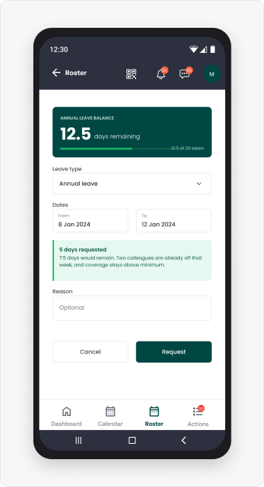
Leave request showing live balance before date selection
Sick leave in a single action, with cover flagged automatically
Inline availability editing, week by week
Notifications that open in context, not on the home screen
The data layer stayed shared — an approval on web appeared on mobile immediately, because the moment those two disagree the whole system loses credibility. What differed was what each surface was for. Mobile navigation came down to four tabs, with every common task within two taps.
One decision worth isolating: showing leave balance before date selection rather than after submission. The most common employee complaint wasn't being rejected — it was being rejected for a reason they had no way of knowing in advance. Balance-first turned a failure state into a constraint people could work with.


Edge cases
Where the design actually got tested.
Workforce products are judged on their exceptions. The happy path is a demo. The exceptions are the job.
01
Concurrent requests, same dates
Queued rather than resolved first-come-first-served, with a coverage impact preview for each option so the manager decides in context.
02
Insufficient leave balance
Shows the shortfall at request time and offers two routes — adjust the request, or submit with a note for review. Neither silently blocked nor silently allowed.
03
Multi-contract workers
An aggregate hours view across contracts, with each contract's limits enforced independently so neither is breached by activity under the other.
04
Absence below coverage floor
The manager receives the gap and a ranked list of available cover in the same notification — reducing time-to-resolution, not just time-to-awareness.
05
Cross-location borrowing
Shifts extendable to another site's pool, with employee consent captured on mobile, without breaking the scheduling rules of either location.
An interaction that works at twenty employees can be unusable at two hundred. Scale isn't an edge case in the sense of being rare — it's the condition the product needed to survive, and it invalidated more of my early work than any other constraint.
It forced a rethink of hierarchy, density, and how much to expose at once. Every pattern had to be judged twice: once for whether it was clear, and again for whether it was still clear a hundred rows down. The redesigned web experience worked practically to around 250 employees. Mobile stayed deliberately narrower rather than pretending the same interaction would hold.
Delivery
What shipped, and what it took.
Nobody was going to approve twelve months of foundational work with no visible output. So the system didn't begin as a proposal — it began as the main dashboard, which was already on the roadmap and already needed rebuilding.
That screen is where the primitives got decided: the colour palette, the typeface and the scale, the spacing, the first real buttons. Choosing them for a specific screen rather than in the abstract meant every decision had to survive contact with actual content on day one. And because the dashboard was the screen everyone saw first, the argument for the rest of the system had a working reference instead of a deck.
Engineering
My early concepts exposed more actions and more information directly on the roster surface — the logic being that if a manager can see it, they can act on it without navigating away. Engineering surfaced what that cost at larger employee counts: performance and state management were the constraint, not screen real estate. I reduced the interaction density, but held the part that mattered — a manager still had to see who was scheduled, spot a problem, and act on it without losing their place. What I gave up was breadth of action. What I protected was hierarchy.
Support
Support was the most useful input I had, because they were seeing the same confusions repeat across customers. That let me separate an isolated usability complaint from a recurring workflow problem — a distinction that's almost impossible to make from inside a design file. Combined with behavioural data and conversations about how customers actually ran their scheduling, it changed what we prioritised. The final design wasn't the product of my UX assessment alone, and it was better for that.
Where I conceded
The mobile scope. I'd wanted more roster management on the phone and had to accept it wasn't viable at the density and scale we were designing for. Mobile became the surface for smaller, focused tasks and visibility rather than a second planning environment. Reading it back it looks like strategy — at the time it was giving up on something I'd argued for.
How it shipped
In a single release rather than phased. That raised the cost of getting the model wrong, which is why so much of the work went into scale and edge cases before anything was built — there was no staged rollout to catch a bad assumption partway through.
Outcome
What changed.
62%
Faster roster creation
Median time to publish a weekly roster fell from 47 minutes to 18.
The number that mattered less but told us more: post-publish editing dropped away. Managers stopped treating publish as a draft state, because the things they used to discover afterwards were now visible while they were still scheduling.
The clearest signal wasn't in the product analytics at all — it was that the workarounds started disappearing. The WhatsApp groups for shift changes, the email chains for leave approvals. People route around systems they don't trust. When they stop routing around it, the product is doing its job.
01
Constraint visibility is a feature, not a failure state
Surfacing limits early prevents errors and builds trust. Surfacing them late just catches people out.
2
A platform split only works when each surface has a different job
Compressing a manager's interface onto a phone isn't a mobile strategy.
3
Complexity doesn't disappear — it gets structured
The interface doesn't need to be simple. It needs to be honest about what's hard and clear about what to do next.
Scheduling errors create coverage gaps. Poor leave management creates legal exposure. Employees who can't trust the schedule disengage. Designing the system to carry that complexity — rather than hide it — was the work that mattered.